a• mor• phous
DATA VISUALIZATION SCULPTURES
Typology: Data Visualization using TouchDesigner
Timeline: Fall 2023
Advisors: Nathan Su
Collaborators: Sean Meng, Shuocheng Li,
Jenny Lee
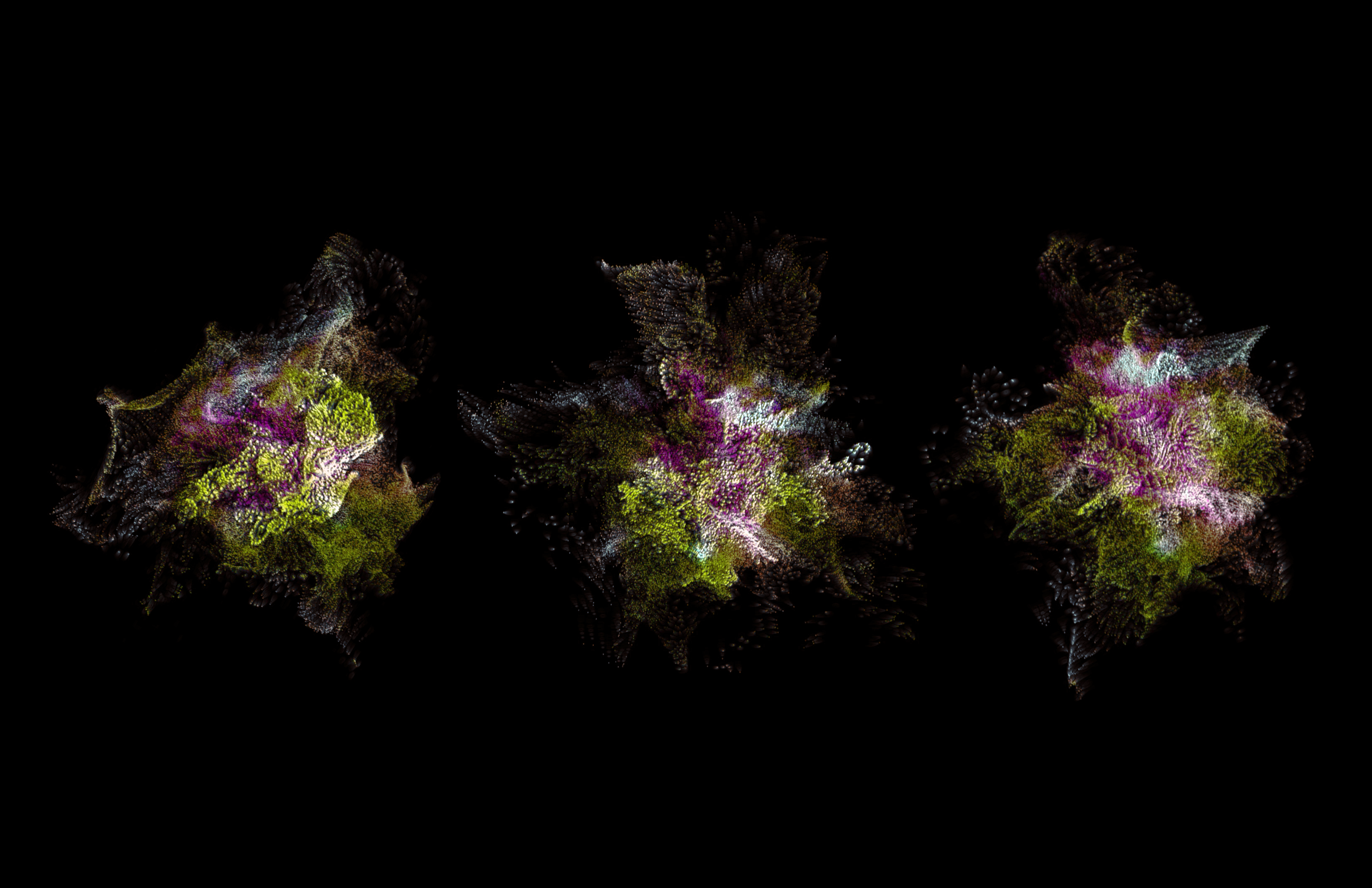
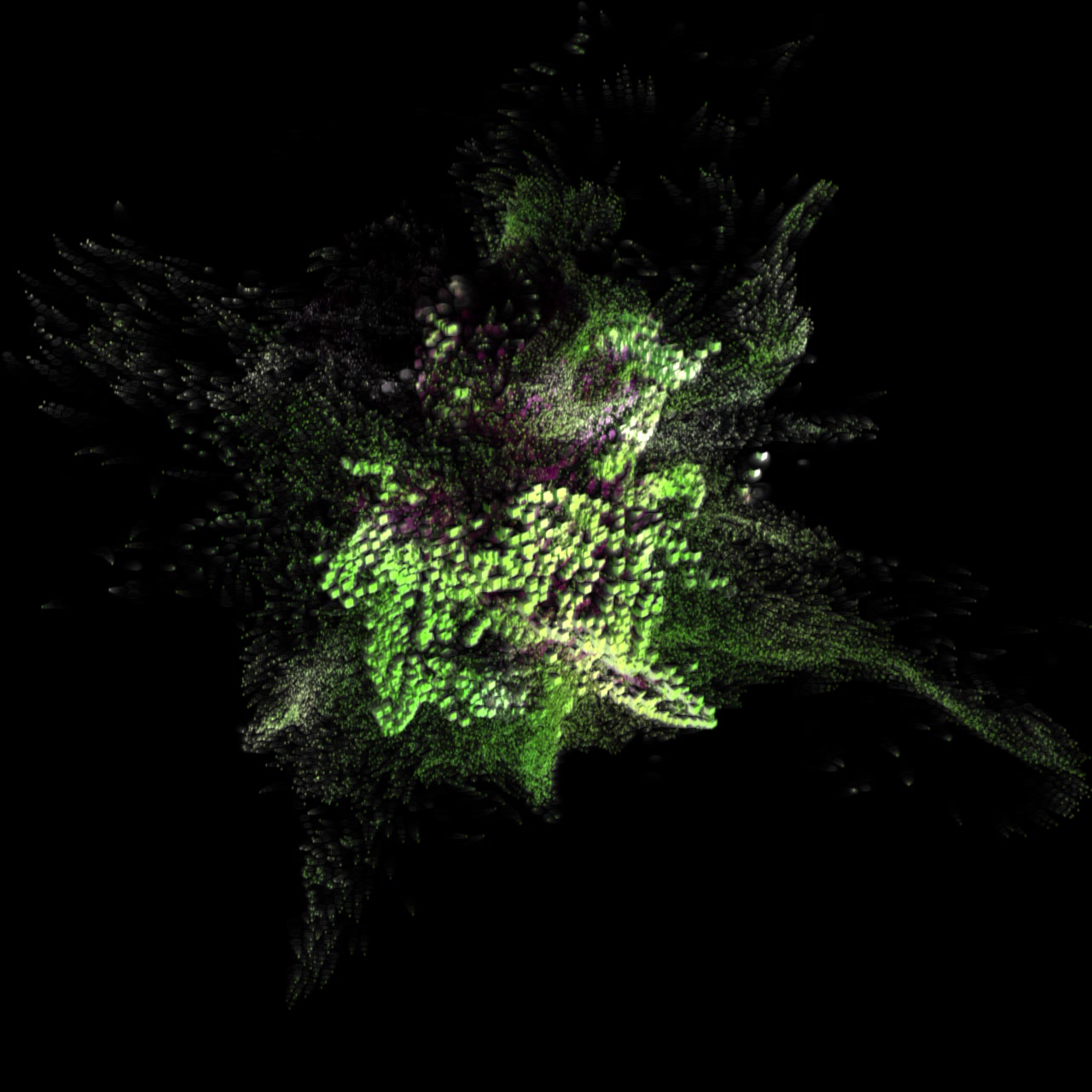
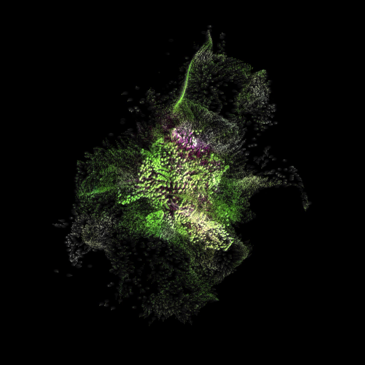
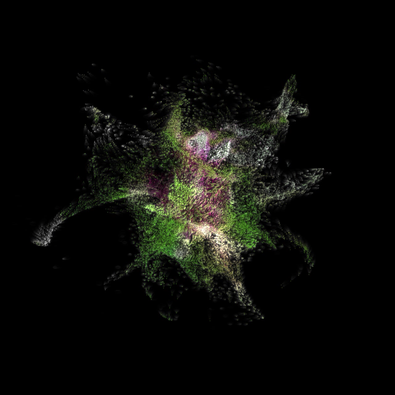
a • mor • phous explores the intersection of technology and climate change, with the goal of increasing awareness and understanding of this critical issue. We used TouchDesigner to transform data into visually stunning and informative art; that we call Climate Paintings.
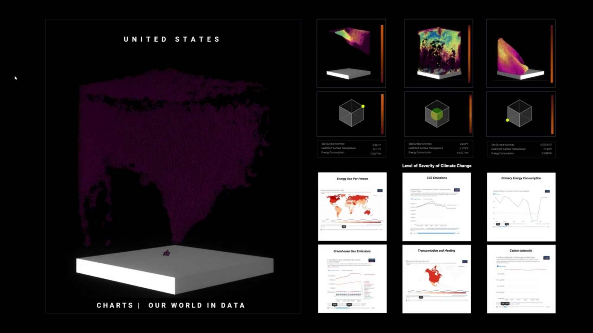
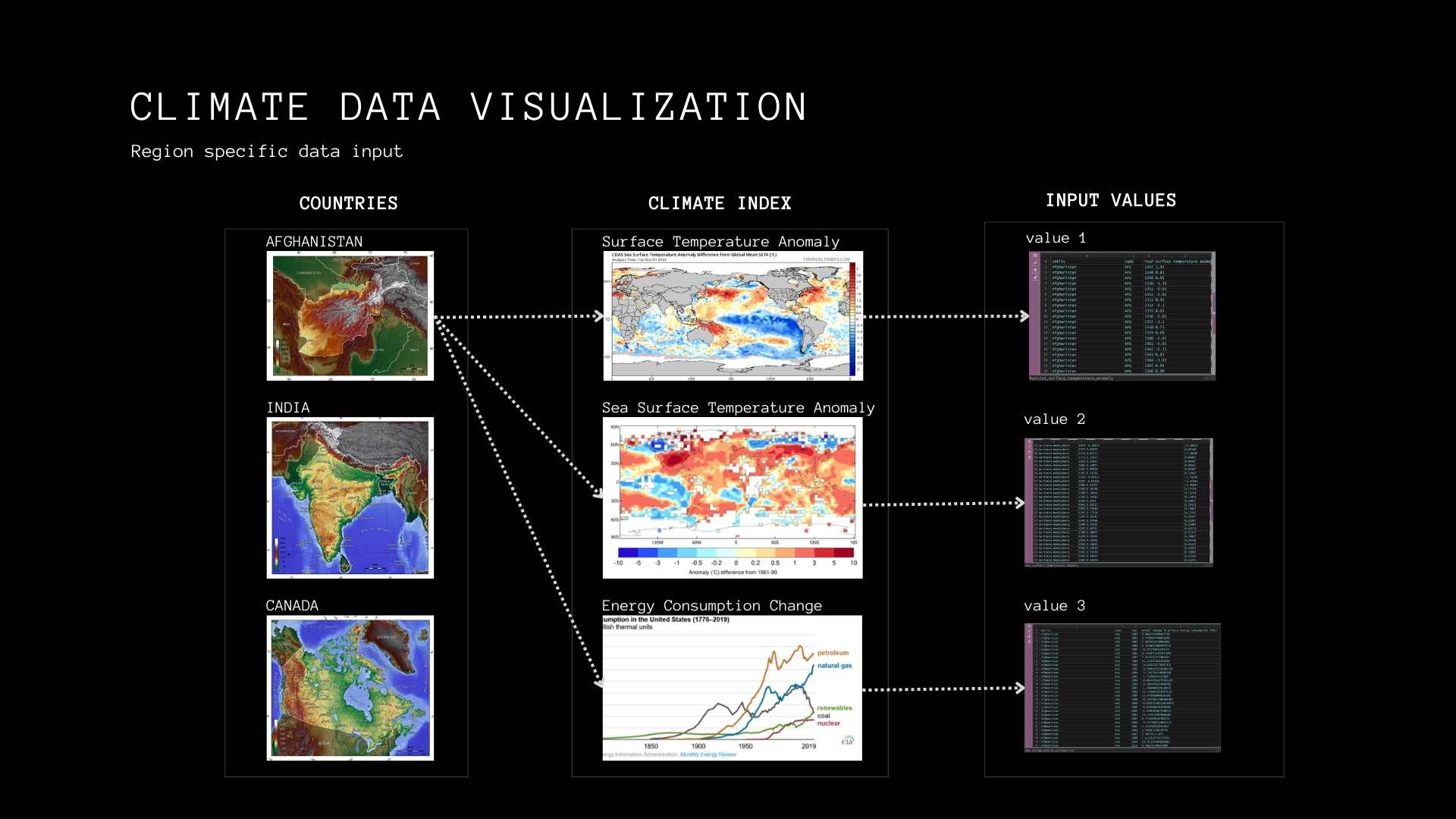
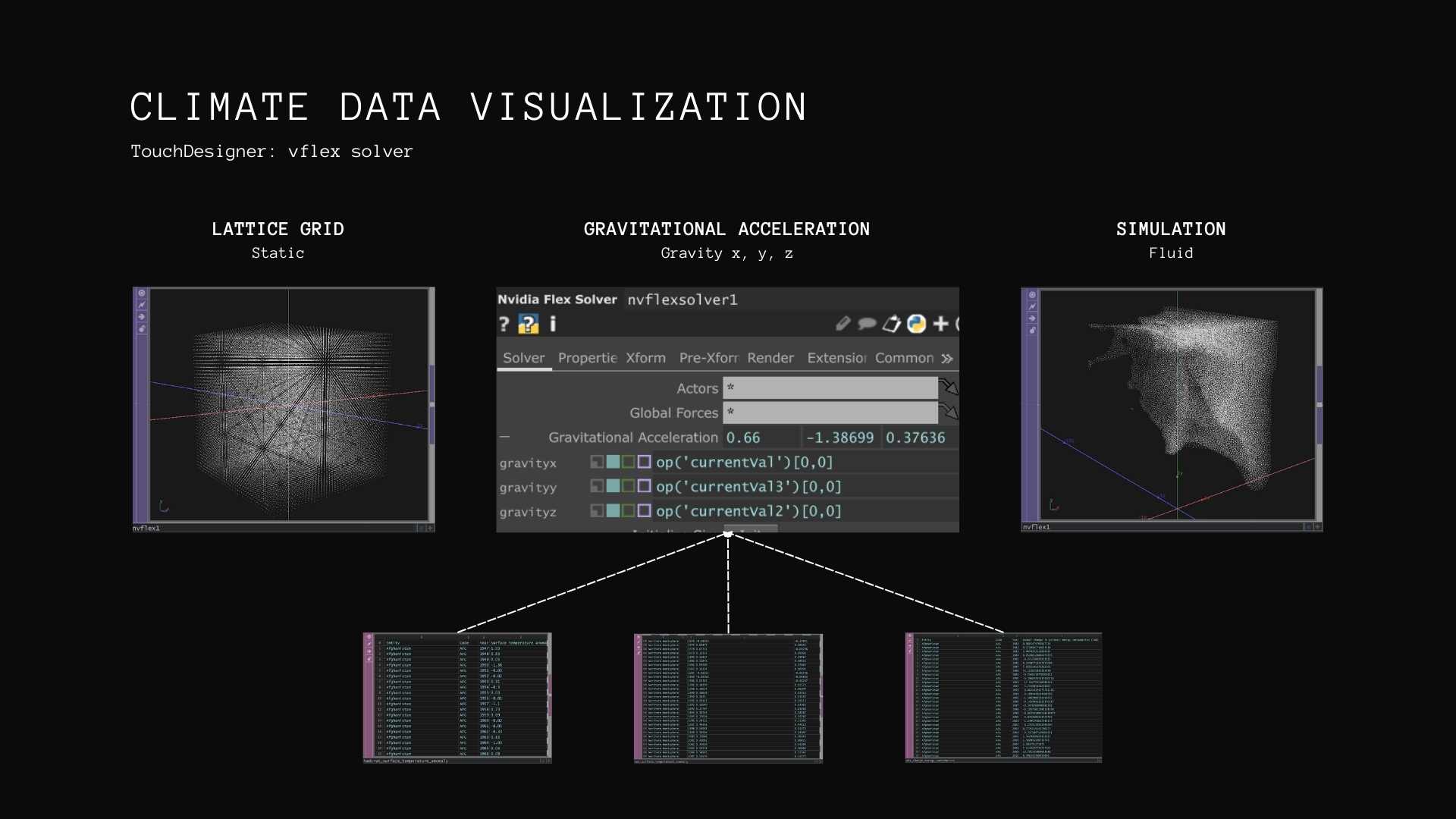
Our project focused on transferring obscured data from numeric form to visual interpretation, utilizing data visualization to interpret complex data sets. We collected data spreadsheets on a specific country and used three indexes - surface temperature anomaly, sea surface temperature anomaly, and energy consumption change - to describe climate change severity.
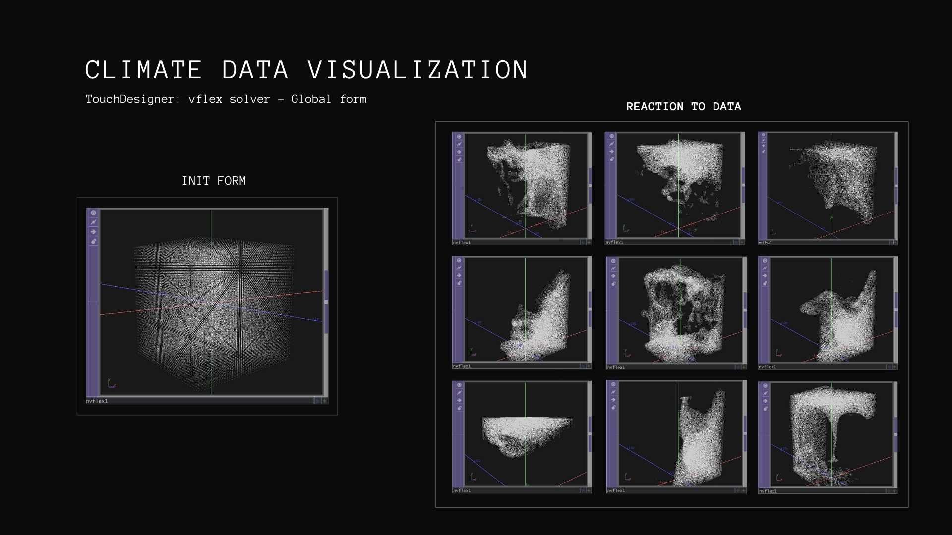
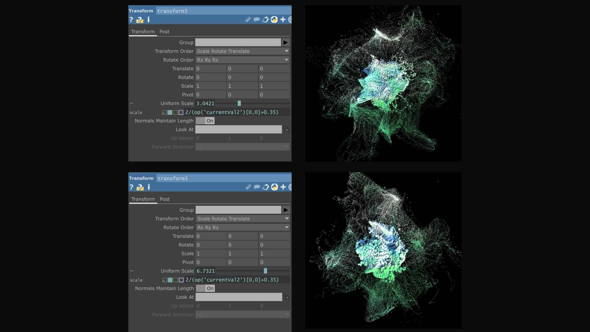
We then used TouchDesigner to input and combine these graphs, making it easier to visualize the peaks and troughs of the chosen data set. We experimented with engaging additional layers of visual information, such as micro characterization of each point, using volumetric geometry, dimension, and color code to display speed variation and location of the voxels.
Our project focused on transferring obscured data from numeric form to visual interpretation, utilizing data visualization to interpret complex data sets. We collected data spreadsheets on a specific country and used three indexes - surface temperature anomaly, sea surface temperature anomaly, and energy consumption change - to describe climate change severity.
We then used TouchDesigner to input and combine these graphs, making it easier to visualize the peaks and troughs of the chosen data set. We experimented with engaging additional layers of visual information, such as micro characterization of each point, using volumetric geometry, dimension, and color code to display speed variation and location of the voxels.
CLIMATE PAINTINGS
Our project drew inspiration from artists like Refik Anadol, who use data as a medium to create immersive experiences.
As a critical component of our project, we designed an interface that linked the visual information with data inputs. The interface included a location map and data values that provided a clear understanding of the climate data for all 18 countries. Through this interface, we were able to compare and contrast the severity of climate change, its changes over time, and the geographic differences between countries.
As a critical component of our project, we designed an interface that linked the visual information with data inputs. The interface included a location map and data values that provided a clear understanding of the climate data for all 18 countries. Through this interface, we were able to compare and contrast the severity of climate change, its changes over time, and the geographic differences between countries.
PROTOTYPE
001
002
003
004

Region-specific Data
Geometric Variation
Grid Design
Micro characterization
Reaction to Data
NVIDIA Flex Solver COMP